

Posts tagged with 'information visualization'

They say a picture is worth a thousand words. So what about an infographic? Information graphics, or infographics, recently emerged as a highly popular and effective medium for visualizing and sharing information. According to visual.ly, a website that helps users ...


Photos by the Metropolitan Transportation Authority of the State of New York Metropolitan Transportation Authority, New York City’s public transit authority, revealed a new interactive touch-screen kiosk with real-time service status on Monday. The project, “On the Go! Travel ...
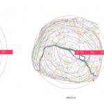
Xiaoji Chen, a graduate of the Massachusetts Institute of Technology, created isochronic maps of Paris and Singapore that represent distance on a map proportionally to travel time. The distorted maps show that the distance between any two stops in a city ...
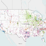
Today, the U.S. Department of Energy released an interactive map displaying thousands of alternative fuel stations around the nation, as part of a complete overhaul of Energy.gov. Color-coded points represent various alternative fuel sources, including electric and hydrogen stations. In ...
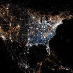
Eric Fischer, a programmer and designer, created maps showing the locations of people when they send a Twitter message or upload a photo to Flickr. Orange dots represent the location of Flickr pictures, blue dots represent Twitter tweets and white dots ...
This post is part of a series analyzing the solutions highlighted in the report and toolkit, “Megacities on the Move.” The report, written by Forum for the Future in partnership with FIA Foundation, Vodafone, and EMBARQ, offers six sustainable mobility ...
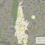
Above is an image of areas in the Columbia Heights neighborhood in Washington, D.C., specifically at Meridian Street and 14th Street, that are accessible within 15 minutes, thanks to a new mapping tool called Mapnificent, powered by Google Maps. Mapnificent is less ...

